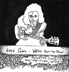
Here's the original cover design; the artwork was reduced and subjected to a heavy graphic approach- no grey tones, all black and white.
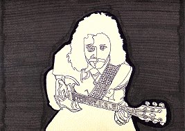
As you can see, the original artwork, greatly reduced here, had a lot of subtleties which did not transfer well using the process available to produce the original cassette cover. This links to a crop of the full sized (12"x12") work.
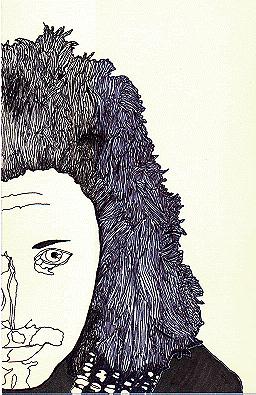
Water From the Moon was originally intended to be a vinyl LP of course- remember the date, CDs hadn't taken over the market yet, they were just getting started- so the original artwork was designed with those packaging dimensions in mind. This is a reduction of a piece of art that was intended either for the back cover or for the inner gatefold, if I could manage to get one. I was convinced SST would pick this up- in retrospect of course, it's a good thing they didn't. This artwork didn't even make the cassette package in the long run, but I think it stands up on its own.
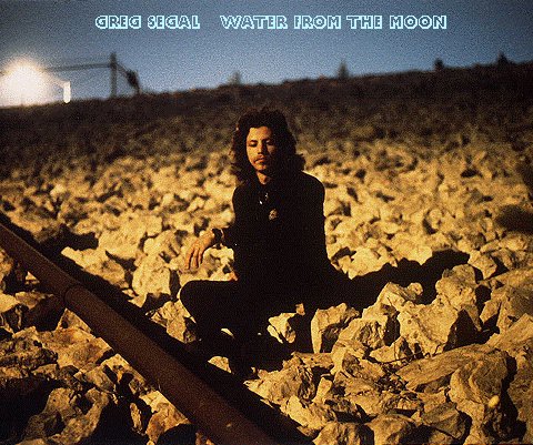
An alternate cover idea- possibly even to be used in conjunction with the artwork, most likely as a back cover- was this color shot taken by Ken Zelinka out at Sepulveda Dam at night in January '88. I think it captures a lot of what the album is about. This was an unusually long period of time between the completion of recording (April '87) and taking photos; but I was incredibly busy with Paper Bag at this time, as well as mixing down Night Circus and remixing A Man Who was here. No one had picked the album up yet, so there hadn't been a rush; and when Ken became available I jumped at the chance.
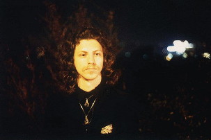
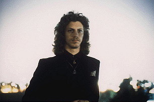
These were taken the same night and location- the whole shoot was terrific. The top one appears in black and white on the main page for this project- I found it seemed to capture the proper mood even more intensely that way.
More to come....
Return to the Greg Segal Home Page